


Background images are selectable via a RokGallery interface, or through a standalone alternative.
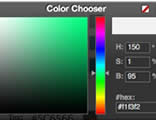
ColorChooser allows you to modify the color scheme easily. Choose from light/dark modes as well as full color controls over other backgrounds, text, and links.
Read MoreModule Variations allow you to individually style a module Enter any available suffixes at Extensions → Module Manager → Module → Module Class Suffix
There are 58 suffixes: basic box1-2, title1-3, rounded, square, dark10-95 and light10-95; nomargintop, nomarginbottom, nomarginright, nomarginleft, nopaddingtop, nopaddingbottom, nopaddingright and nopaddingleft; flush, flushtop and flushbottom; plus standardcase, uppercase and lowercase.
Note: You can compound multiple suffixes together such as dark10 nomarginleft standardcase flushbottom.
- Basic: no module title or background styling
- Title: 3 variations to change the module title.
- Box: 2 variations to change the module background.
- Dark10-95 (increments of 5): 18 variations to change the module background.
- Light10-95 (increments of 5): 18 variations to change the module background.
- Rounded: rounds the module corners.
- Square: squares the module corners.
- Standard/Upper/Lower Case: change the case of the module title.
- NoMarginTop/Bottom/Left/Right: removes the various margins around the module.
- NoPaddingTop/Bottom/Left/Right: removes the various paddings around the module
- Flush/FlushTop/FlushBottom: removes the margin/padding around the module surround.
To replicate, use the following formatting: <blockquote><p>....</p></blockquote> (HTML) or [blockquote class="default"]...[/blockquote] (ROKCANDY).
Praesent rutrum sapien ac felis. Phasellus elementum dolor quis turpis.
To replicate, use the following formatting: <blockquote class="alignleft"><p>....</p></blockquote> (HTML) or [blockquote class="alignleft"]...[/blockquote] (ROKCANDY).
Lorem ipsum dolor sit amet, consectetur adipiscing elit. Mauris metus tortor, commodo sit amet tempor id, gravida eget orci. In molestie feugiat nunc ac lobortis. Ut non nisi dolor, ac ultricies lorem. Vestibulum non lectus in arcu gravida malesuada. Curabitur sed sollicitudin mi. Aenean sit amet tortor ac arcu gravida rutrum eget ac dui. Phasellus rutrum dapibus nulla, a venenatis tortor eleifend vitae. Ut tincidunt vestibulum blandit. Nulla aliquet urna non enim convallis in vehicula mi scelerisque. Aliquam blandit imperdiet lorem eu ultrices. Nulla in dolor non ipsum fringilla sodales sed ac turpis. Nam nisi arcu, tincidunt sodales.
Praesent rutrum sapien ac felis. Phasellus elementum dolor quis turpis.
To replicate, use the following formatting: <blockquote class="alignright"><p>....</p></blockquote> (HTML) or [blockquote class="alignright"]...[/blockquote] (ROKCANDY).
Lorem ipsum dolor sit amet, consectetur adipiscing elit. Mauris metus tortor, commodo sit amet tempor id, gravida eget orci. In molestie feugiat nunc ac lobortis. Ut non nisi dolor, ac ultricies lorem. Vestibulum non lectus in arcu gravida malesuada. Curabitur sed sollicitudin mi. Aenean sit amet tortor ac arcu gravida rutrum eget ac dui. Phasellus rutrum dapibus nulla, a venenatis tortor eleifend vitae. Ut tincidunt vestibulum blandit. Nulla aliquet urna non enim convallis in vehicula mi scelerisque. Aliquam blandit imperdiet lorem eu ultrices. Nulla in dolor non ipsum fringilla sodales sed ac turpis. Nam nisi arcu, tincidunt sodales.
This is a sample <pre class="lines">...</pre> (HTML) or,
[pre2 class="{lines}"] ... [/pre2] (ROKCANDY) tag:

div.modulebox-black div.bx1 {
  background: url(../images/black/box_bl.png) 0 100% no-repeat;
}

div.modulebox-black div.bx2 {
  background: url(../images/black/box_tr.png) 100% 0 no-repeat;
}

div.modulebox-black div.bx3 {
  background: url(../images/black/box_tl.png) 0 0 no-repeat;
  padding: 0;
  margin: 0;
}
This is a sample <pre>...</pre> (HTML) or,
[pre class="{lines}"] ... [/pre] (ROKCANDY) tag:

div.modulebox-black div.bx1 {
  background: url(../images/black/box_bl.png) 0 100% no-repeat;
}

div.modulebox-black div.bx2 {
  background: url(../images/black/box_tr.png) 100% 0 no-repeat;
}

div.modulebox-black div.bx3 {
  background: url(../images/black/box_tl.png) 0 0 no-repeat;
  padding: 0;
  margin: 0;
}
Praesent rutrum sapien ac felis. Phasellus elementum dolor quis turpis. Vestibulum nec mi vitae pede tincidunt nonummy. Vestibulum facilisis mollis neque. Sed orci. Cum sociis natoque penatibus magnis.
Use the following format: <p class="dropcap">...</p> (HTML) or [dropcap class="dropcap"]...[/dropcap] (ROKCANDY). You can use any letter, symbol or number.
Praesent rutrum sapien ac felis. Use this format: <p class="dropcap2">...</p> (HTML) or [dropcap class="dropcap2"] ... [/dropcap] (ROKCANDY)
Praesent rutrum sapien ac felis. Use this format: <p class="dropcap3">...</p> (HTML) or [dropcap class="dropcap3"] ... [/dropcap] (ROKCANDY)
Praesent rutrum sapien ac felis. Use this format: <p class="dropcap4">...</p> (HTML) or [dropcap class="dropcap4"] ... [/dropcap] (ROKCANDY)
Praesent rutrum sapien ac felis. Use this format: <p class="dropcap5">...</p> (HTML) or [dropcap class="dropcap5"] ... [/dropcap] (ROKCANDY)
Praesent rutrum sapien ac felis. Use this format: <p class="dropcap6">...</p> (HTML) or [dropcap class="dropcap6"] ... [/dropcap] (ROKCANDY)
Praesent rutrum sapien ac felis. Use this format: <p class="dropcap7">...</p> (HTML) or [dropcap class="dropcap7"] ... [/dropcap] (ROKCANDY)
Praesent rutrum sapien ac felis. Phasellus elementum dolor quis turpis. Vestibulum nec mi vitae pede.
Proin ac nunc eu nunc condimentum accumsan. Phasellus odio justo, euismod vitae, egestas a.
This is a H1 Header
Lorem ipsum dolor sit amet, consectetuer adipiscing elit. Proin sit amet odio quis sapien molestie ultrices.
This is a H2 Header
Proin ac nunc eu nunc condimentum accumsan. Phasellus odio justo, euismod vitae, egestas a, porttitor
This is a H3 Header
Mauris euismod. In ac massa vitae quam tincidunt dapibus. Ut at tortor nec mi mattis blandit.
This is a H4 Header
Vestibulum posuere, lacus aliquet pulvinar faucibus, tortor urna luctus diam, vitae ultrices ante.
This is a H5 Header
Pellentesque vel enim urna, sit amet blandit ipsum. Maecenas quis sem sit amet nunc pretium mattis. Sed dapibus semper est, sed pretium erat sodales sed. Aenean hendrerit fringilla sem, et tincidunt libero ornare at.
- This is an example of a standard list style. Lorem ipsum dolor sit amet, consectetur adipiscing elit. Donec sit amet nibh. Vivamus non arcu.
- This is an example of a standard list style. Lorem ipsum dolor sit amet, consectetur adipiscing elit. Donec sit amet nibh. Vivamus non arcu.
- To use this style create a list in the following format: <ul class="bullet"><li>....</li><li>....</li>...</ul> (HTML).
- To use this style create a list in the following format: [list class="bullet"][li]...[/li][li]...[/li][/list] (ROKCANDY).
To replicate, the following format: <span class="text-icon iconname">...</span> (HTML) or [icon class="icon name"]...[/icon] (ROKCANDY). The class names are listed below, such as "text-icon email".
These list styles are based on the latest CSS3 techniques and are designed to work in modern browsers (will not display properly in IE6-IE8).
To replicate, use the following format: <ul class="class name"><li>....</li><li>....</li>...</ul> (HTML) or [list class="class name"][li]....[/li][li....[/li][/list] (ROKCANDY). The class names are listed below, such as "checkmark red".
- Checkmark
- Checkmark
- Checkmark
- Circle-Checkmark
- Circle-Checkmark
- Circle-Checkmark
- Square-Checkmark
- Square-Checkmark
- Square-Checkmark
- Checkmark Green
- Checkmark Green
- Checkmark Green
- Checkmark Yellow
- Checkmark Yellow
- Checkmark Yellow
- Checkmark Red
- Checkmark Red
- Checkmark Red
- Checkmark Blue
- Checkmark Blue
- Checkmark Blue
- Checkmark White
- Checkmark White
- Checkmark White
- Triangle-Small
- Triangle-Small
- Triangle-Small
- Triangle
- Triangle
- Triangle
- Triangle-Large
- Triangle-Large
- Triangle-Large
- Triangle Green
- Triangle Green
- Triangle Green
- Triangle Yellow
- Triangle Yellow
- Triangle Yellow
- Triangle Red
- Triangle Red
- Triangle Red
- Triangle Blue
- Triangle Blue
- Triangle Blue
- Triangle White
- Triangle White
- Triangle White
- Circle-Small
- Circle-Small
- Circle-Small
- Circle
- Circle
- Circle
- Circle-Large
- Circle-Large
- Circle-Large
- Circle Green
- Circle Green
- Circle Green
- Circle Yellow
- Circle Yellow
- Circle Yellow
- Circle Red
- Circle Red
- Circle Red
- Circle Blue
- Circle Blue
- Circle Blue
- Circle White
- Circle White
- Circle White
This is a emphasis tag that allows you to highlight words or phrases. Use the following format: <em class="italic">...</em> (HTML) or [emphasis]...[/emphasis] (ROKCANDY)
This is a emphasis tag that allows you to highlight words or phrases. Use the following format: <em class="bold">...</em> (HTML) or [emphasisbold]...[/emphasisbold] (ROKCANDY)
This is a emphasis tag that allows you to highlight words or phrases. Use the following format: <em class="bold2">...</em> (HTML) or [emphasisbold2]...[/emphasisbold2] (ROKCANDY)
This is a emphasis tag that allows you to highlight words or phrases. Use the following format: <em class="highlight">...</em> (HTML) or [highlight class="default"]...[/highlight] (ROKCANDY)
This is a emphasis tag that allows you to highlight words or phrases. Use the following format: <em class="highlight white">...</em> (HTML) or [highlight class="white"]...[/highlight] (ROKCANDY)
This is a emphasis tag that allows you to highlight words or phrases. Use the following format: <em class="highlight black">...</em> (HTML) or [highlight class="black"]...[/highlight] (ROKCANDY)
This is a emphasis tag that allows you to highlight words or phrases. Use the following format: <em class="highlight green">...</em> (HTML) or [highlight class="green"]...[/highlight] (ROKCANDY)
This is a emphasis tag that allows you to highlight words or phrases. Use the following format: <em class="highlight yellow">...</em> (HTML) or [highlight class="yellow"]...[/highlight] (ROKCANDY)
This is a emphasis tag that allows you to highlight words or phrases. Use the following format: <em class="highlight blue">...</em> (HTML) or [highlight class="blue"]...[/highlight] (ROKCANDY)
This is a emphasis tag that allows you to highlight words or phrases. Use the following format: <em class="highlight red">...</em> (HTML) or [highlight class="red"]...[/highlight] (ROKCANDY)
Praesent rutrum sapien ac felis. Phasellus elementum dolor quis turpis. Vestibulum nec mi vitae pede tincidunt nonummy. Vestibulum facilisis mollis neque. Sed orci. Cum sociis natoque penatibus et magnis dis parturient montes, nascetur ridiculus mus. Inset Right TitleYou will need to use the following formatting: <span class="inset-right"> <span class="inset-right-title"> .... </span> ... some content ... </strong> (HTML) or [inset side="right" title="Inset Right Title"] ... some content ...[/inset] (ROKCANDY) Vestibulum facilisis mollis neque. Sed orci. Cum sociis natoque penatibus et magnis dis parturient montes, nascetur ridiculus mus. Sed euismod magna a nibh.
Praesent rutrum sapien ac felis. Phasellus elementum dolor quis turpis. Vestibulum nec mi vitae pede tincidunt nonummy. Vestibulum facilisis mollis neque. Sed orci. Cum sociis natoque penatibus et magnis dis parturient montes, nascetur ridiculus mus. Inset Left TitleYou will need to use the following formatting: <span class="inset-left"> <span class="inset-left-title"> .... </span> ... some content ... </strong> (HTML) or [inset side="left" title="Inset Left Title"] ... some content ...[/inset] (ROKCANDY) Vestibulum facilisis mollis neque. Sed orci. Cum sociis natoque penatibus et magnis dis parturient montes, nascetur ridiculus mus. Sed euismod magna a nibh.
Sed euismod magna a nibh. Praesent rutrum sapien ac felis. Phasellus elementum dolor quis turpis. Vestibulum nec mi vitae pede tincidunt nonummy. Praesent rutrum sapien ac felis. Phasellus elementum dolor quis turpis. Vestibulum nec mi vitae pede tincidunt nonummy. Vestibulum facilisis mollis neque.
Cum sociis natoque penatibus et magnis dis parturient montes, nascetur ridiculus mus.Praesent rutrum sapien ac felis. Phasellus elementum dolor quis turpis. Vestibulum nec mi vitae pede tincidunt nonummy. Vestibulum facilisis mollis neque. Sed orci. Cum sociis natoque penatibus et magnis dis parturient montes, nascetur ridiculus mus.
This is a sample of the Approved style. To replicate, use the following html: <p class="approved">....</p> (HTML) or [notice class="approved"] ... [/notice] (ROKCANDY).
This is a sample of the Attention style. To replicate, use the following html: <p class="attention">....</p> (HTML) or [notice class="attention"] ... [/notice] (ROKCANDY).
This is a sample of the Notice style. To replicate, use the following html: <p class="notice">....</p> (HTML) or [notice class="notice"] ... [/notice] (ROKCANDY).
This is a sample of the Alert style. To replicate, use the following html: <p class="alert">....</p> (HTML) or [notice class="alert"] ... [/notice] (ROKCANDY).
If you are using the TinyMCE editor, go to Extensions → Plugin Manager → TinyMCE 2.0 → Set Code Clean-up on Save to Never.
Typography - RokCandy
In this example, we will use the Attention Span Style - Syntax: [div class="attention" class2="typo-icon"]...[/div] syntax.
Typography - HTML
In this example, we will use the Attention Span Style - Syntax: <div class="attention"><div class="typo-icon">...</div></div> syntax.
Content Editor
No Editor
Note, with the Content Editor (WYSIWYG) enabled, you need to enter HTML mode.
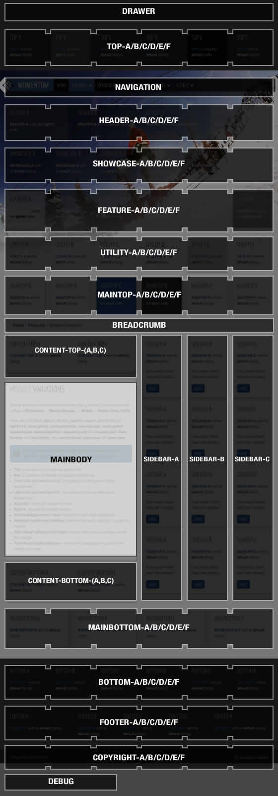
There are 78 module positions. If no module is published to a position, it will not appear, collapsing the entire area.
Non-Standard Elements
There are non-standard elements that are injected into the template grid structure when enabled via the template parameter, such as the logo into header-a. These features stack vertically with any modules published to that position.
You can change the positions of these elements at Extensions → Template Manager → (J15) rt_momentum_j15 or (J17) rt_momentum
Layout Control
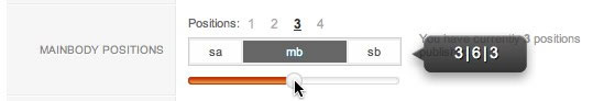
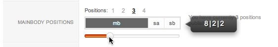
Control all modules positions with Gantry, in terms of widths within the module row, and left/right/middle placement for the mainbody/sidebar area.
Gantry Framework : Layouts Documentation
Preview Positions
View all module positions live by appending ?tp=1 or &tp=1 to the end of your URL such as http://yoursite.com/index.php?tp=1.
The below diagram is of the Module Variations page.
Demo Utilities

RokCandy
RokCandy is a snippet inserter, that transforms custom syntax into complex, HTML elements upon rendering of the content item.

RokPad
RokPad is a code editor for Joomla, providing a rich UI and advanced features for HTML code editing in Joomla content articles.

RokBox
RokBox, is a Mootools powered, popup plugin, that can load images, videos, web pages and other elements in a styled popup.